


Introduction
In this digitally growing world, every day, businesses make critical decisions that shape their future, yet many operate as if blindfolded, unable to interpret the growing mountains of data before them. Hopping not, but this is the reality of many firms unable to interpret the growing data. For any business, clear and actionable insights are the main elements of making decisions that are lacking, and thus, you face many challenges like identifying trends, predicting outcomes, and communicating findings.
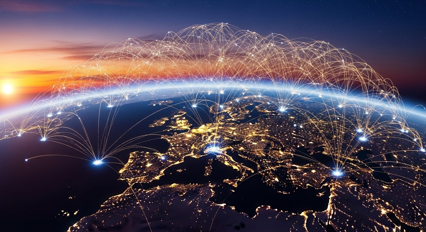
Data visualization bridges this gap, offering clarity through visual storytelling, making complex data not only accessible but impactful. From uncovering hidden patterns to streamlining decision-making, these examples demonstrate the transformative role of visualization in solving critical business problems. Curious to witness how visualization can turn raw data into actionable insights? Continue reading the blog to learn about some amazing data visualization examples that inspire your business to achieve success.
What is Data Visualization
Data visualization is the representation of data graphically in the form of charts, graphs, and maps so that complex information becomes easy to understand. It helps businesses identify patterns, track performance, and communicate insights effectively. By transforming raw data into visual formats, it helps businesses make faster, data-driven decisions and discover opportunities.
Let’s understand this with the example of Amazon, which applied data visualization to track customer purchase behaviors, optimize inventory, recommend products for sales, and improve customer experience. This strategic use of visuals ensures operational efficiency and personalized marketing.
Introducing the 5 Best Practices of Data Visualization
As discussed above, data visualization is an essential tool for presenting information clearly and meaningfully through various types of graphs and charts. Every organization must also adopt effective practices that can help transform raw data into easy-to-understand and actionable visuals. These methods enable organizations to communicate insights effectively and drive better decision-making.
1. Define Your Purpose Clearly
Start by defining a clear question or insight you’d like to express. This will help you narrow down the information to matters and thus avoid confusing people with unnecessary facts. A defined purpose will ensure that the visualization fulfills its purpose at hand.
2. Choose the Right Chart Type
Each chart type is for a different purpose. There are bar charts for comparison, line charts for trends, and pie charts for proportions. Choosing the wrong chart will confuse your audience and misrepresent your data. The right chart will make insights easy to understand and actionable.
3. Simplify the Design
A clutter-free design ensures clarity and focus on the essential data points. Use a limited number of colors, fonts, and elements to avoid distraction. Simplicity in design makes the visualization professional, appealing, and easy to interpret.
4. Use Accurate Scales and Labels
Incorrect scales or missing labels cause mistrust in the conclusion and damage credibility. All axes, scales, and data points must be labeled correctly. Accurate data will rely on visualization to display the meaning of true data.
5. Make It Interactive and Accessible
Interactive features such as filters, zoom options, and drill-downs allow users to explore data at their own pace. Accessibility ensures the visualization is accessible to a diverse audience, including people with disabilities. This means increased engagement and usability.
Presenting You the Data Visualization Examples
Below is a range of data visualization examples that showcase the transformative power of visual storytelling. It presents amazing ways in which this has been used to turn complicated datasets into simple graphical intakes. Through these visualizations, many businesses can become capable of discovering patterns, trends, and opportunities that drive decision-making using data.
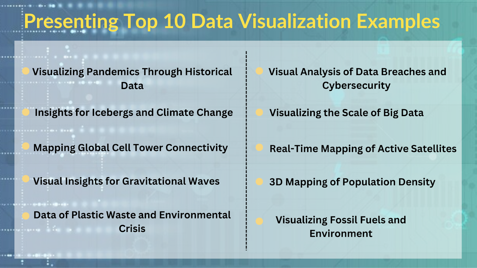
1. Understanding Pandemics Through Historical Data Visualizations
Data visualization has also been used to showcase the pandemics, including the Black Death, Spanish Flu, and COVID-19. The visualization has included the comparison of death tolls, regions affected, and the duration of outbreaks, revealing the impact of the global spread over time. Such visualizations can identify how pandemics spread and what containment measures work. Researchers and policymakers use the findings to predict and prepare for future health crises. It also creates public awareness of the need for preventive measures and cooperation globally.
2. Icebergs and Climate Change: A Visual Story of Global Warming
This visualization shows the melting iceberg patterns due to climate change. It focuses on their contribution to sea levels. Using visual comparisons over decades, it emphasizes how global warming accelerates ice loss. Scientists use this data to research climate patterns and study the long-term environmental risks. Businesses that profit from renewable energy and sustainability rely on these insights to advocate for cleaner solutions. This data also supports government and corporate actions to reduce carbon footprints.
3. Mapping Global Connectivity: Cell Towers Around the World
This is a global distribution of cell towers that maps disparities in connectivity across regions. The visualization highlights areas with high coverage and regions lacking infrastructure, making understanding the digital divide easier. Telecom companies can use the data for expansion planning and optimizing network performance. Governments can also use it to identify rural areas where connectivity is poor and plan connectivity. Visualization leads to better decision-making on how to improve communication networks around the world and fill connectivity gaps.
4. Visualizing Gravitational Waves: Insights into the Universe
This visualization captures the detection of gravitational waves resulting from events like black hole collisions or neutron star mergers. It shows in great detail how space-time ripples caused by such phenomena. Such visualizations help scientists understand complex astrophysical data, explaining the universe’s formation. They also inspire the advancement of technology in space exploration. Moreover, such visuals make advanced physics accessible to educators and the public, which creates interest in astronomy.
5. Plastic Waste Pollution: Highlighting the Environmental Crisis
This visualization presents the quantity and distribution of plastic waste pollution in oceans and on land. It highlights areas with the most contributions to plastic waste and how this accumulates in marine ecosystems, like the Great Pacific Garbage Patch. These insights inspire environmental organizations to run awareness campaigns and initiate policy. Businesses can develop biodegradable packaging through data-driven methods and minimize waste. The visualization will engage stakeholders to work towards plastic pollution as a whole.
6. Data Breaches: A Visual Analysis of Cybersecurity Risks
Visualization like Power BI tracks frequency, scale, and sectors impacted by data breaches over time. It identifies the riskiest industries, finance and healthcare, and depicts the volume of compromised data. For its efficient deployment, many firms use the support of Power BI consultants to use such data to determine which cybersecurity investments to prioritize and how to bolster their defenses. It simplifies the complexity of breach statistics for decision-makers and stakeholders. Through increased awareness, such visualizations force businesses to be more rigorous with their data protection policies.
7. Explaining a Zettabyte: Visualizing the Scale of Big Data
This example elaborates on the huge scale of a zettabyte, or one trillion gigabytes, through interactive comparisons and metaphors. For example, a zettabyte could mean all the data produced globally in a single year. Businesses apply this knowledge to prepare for exponential data growth by investing in scalable storage and analytics solutions. Such visualizations make abstract concepts relatable, helping non-technical stakeholders understand the significance of big data.
8. Active Satellites: Mapping Earth’s Orbit in Real-Time
This visualization maps the number, type, and purposes of active satellites orbiting Earth, showcasing ownership and crowded orbital zones. It also points out trends such as the high growth rate of communication and GPS satellites. The space agencies use this insight to coordinate satellite launches and prevent collisions. Businesses in satellite technology leverage the data to identify competitive opportunities. This visualization is critical in promoting sustainable use of Earth’s orbit.
9. 3D Mapping of Population Density: Insights for Urban Planning
This visualization represents population density with the help of 3D models and depicts the cities and the less populated areas. It gives insights into infrastructure requirements, housing demands, and urbanization trends. The government uses this data for city planning, resource allocation, and designing public services. Many organizations depend on these insights to identify the market potential for further expansion or new product launches. It helps in the efficient planning of public as well as private sector initiatives.
10. Fossil Fuels: Visualizing Environmental Impact and Transition
This visualization captures the environmental effect of fossil fuels through mapping the extraction of fossil fuels, emission of CO2, and their contribution to climate change. It shows the regions with high emissions and the long-term effects of global warming. Data visualization tracks the levels of emissions, provides insight into key sources of pollution, and assesses the efficacy of renewable energy initiatives for businesses and governments. These insights are essential for businesses involved in energy production and those working toward sustainability goals.
Conclusion:
From the above blog, we learned how data visualization examples play an important role in helping businesses and organizations understand complex data and make informed decisions. In today’s business world, where the complexity of data is increasing every day, data visualization helps to communicate key findings that drive strategic decisions better. Most businesses opt for using data visualization services because it helps them unlock valuable information, make room for improved operational efficiency, and simplify the decision-making process. By embracing visualization tools, businesses remain competitive in the ever-increasingly data-driven world.